
Growing up in Red Pheasant Cree Nation, I really took what I had there for granted. I grew up seeing the land, waking up to the skies with all the colours they showed, and going to bed with the skies being the complete opposite colours. My backyard was basically open fields, forests, nature, and wildlife. Moving into the city for university definitely made me reflect a lot during this logo design on my childhood—the moments of seeing coyotes, deer, and all types of wildlife. It really took me back to those times when I’d be colouring next to my family, then getting bored and starting to draw. It made me reflect a lot on my childhood on the reserve and the sense of community and acceptance I had there. I really wanted that to be part of this logo.
MEET The ARTIST


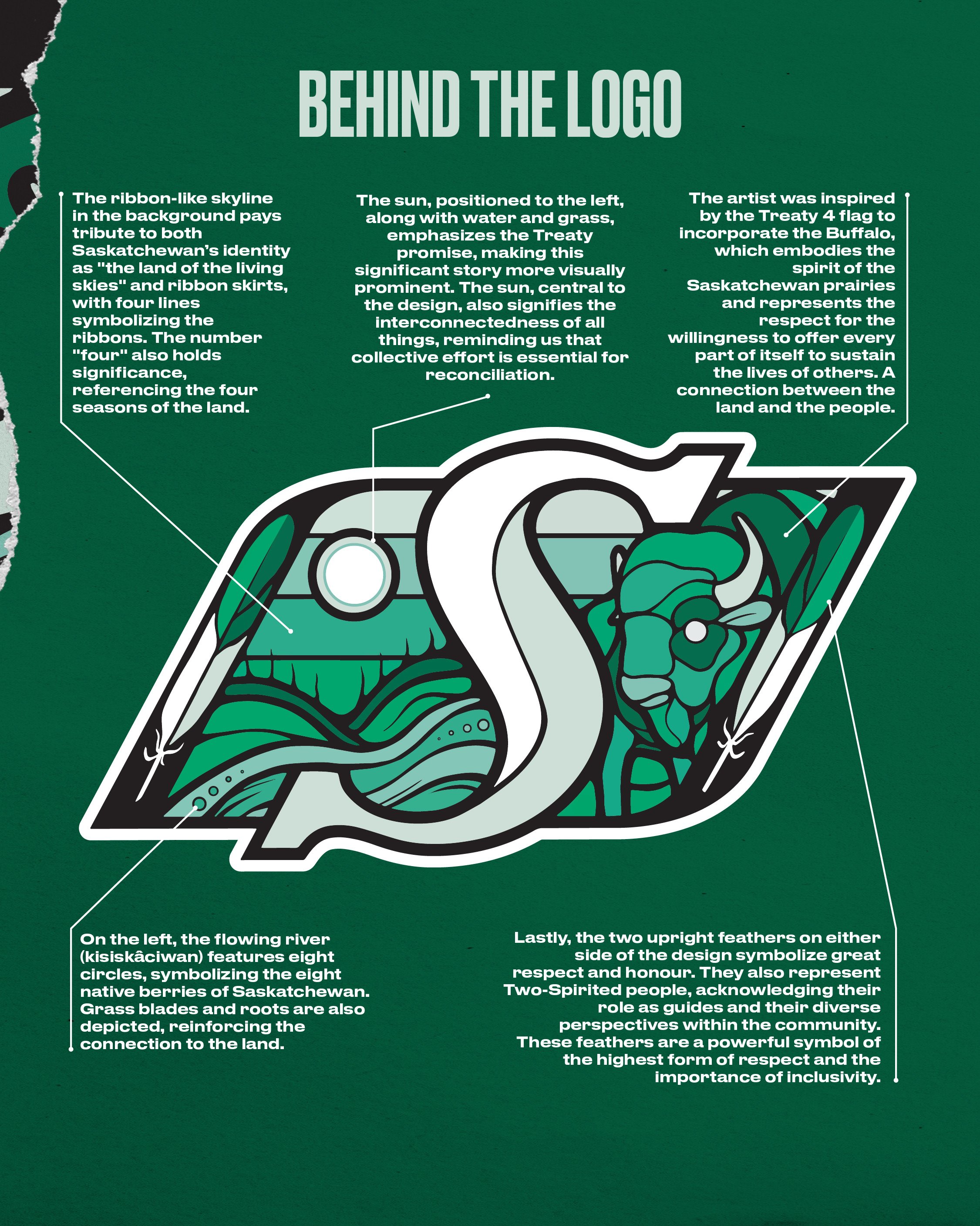


With this design, I wanted everyone to feel like, “I belong here. This makes me feel at home. This makes me resonate with the prairies.” I wanted to show that in the design. When I created this design, I wanted it to be something that screamed prairies—not just Regina or Treaty 4, but something that represented us as a whole province. When I first started, I thought of a buffalo. The buffalo was roaming these lands before Canada even began—and when Canada did start, it was with the separation of land through treaties. On the other side of the design, I wanted to acknowledge the treaty promise: “As long as the sun shines, the river flows, and the grass grows,” we need to share this land and work together.